10 Magazine Covers That Shook the World
Jul 22nd, 2008 | By Krystal | Category: Movie NewsThe L.A. Times has named the now infamous Entertainment Weekly cover with Rob & Kristen as one of the “10 Magazine Covers That Shook the World!” To read why, click here!
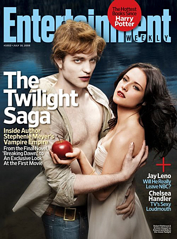
WTH! edward doesn’t have chest hair! and when does bella just where a dress to go nowhere? and why are edwards hand dirty but his nails are all shiny?this doesn’t make sense! its a horrible cover! (i’m still going to frame it though)
i think robert pattinson is much more beautiful than he is depicted there, thank you LA times.
i honestly didn’t think it was as bad as people are saying it was. i mean, yeah, it’s wrong. but what did you expect? it’s obviously not going to be perfect.
haha! that thing made me laugh…
i like the cover and i think people are reading waaay too much into all of this. It seems the cover’s just meant to grab the attention of someone walking by so they’ll buy it.
I like powdered donuts…
Hahaha! Spunk Ransom shook the world, lol.
I think Rob’s hair was mousy looking. Kirsten, however, looked very Bella-ish
Ugh! I hated this cover so much! Ugh! Words can’t even describe!!!!
Bella looked gorgoeus, they just got Edward all wrong.. I think it was all just to get everyone to look at it and shake up the world…………………….and all the fans. It is cool it made the top 10 though………..
I liked it…
At least it shook the world…
I wouldn’t mind it so much if they weren’t just looking at us. In my head, the cover would have looked a hundred times better had they been focusing on each other. That’s kind of what they do anyway…
The first time I saw the cover I really liked it. I think that Edward doesn’t look exactly like what we would expect, but I wouldn’t go to the extent of saying that “Edward looks like a zombie” and “the stylist and photographer obviously had no idea what the characters are.” That’s just goes too far. I think we all have to except that the actors and actresses won’t look exactly the way we pictured them every minute of the day. We have to relax a little and appreciate that they made the cover, and everyone has their own take on different characters.
I thought Bella looked very pretty.
::goes into defensive mode:: Okay that was soo mean!! I really hope Rob didn’t read that. ::shudders:: UGH!! I’m so pissed!! What is wrong with people??? Wtf photographers??!! Really? really?!! He’s so much more gorgeous that depicted here. I’m a photographer myself, and that’s why i’m so pissed. They could have done so much better.
Okay and Bella?? Nope! stop! wrong!! They totally Hollywood~ed her out to much. They like.. took it to extremes. Ugh!! This cover was insane.
::coughs:: >.> okay so on a better note, i thought the rest of the pictures were lovely. ^^
WOW! I think thats really big!!!!!!!!!!!!!!
Ok I read it and am I the only one who thinks those pics are good?
I was really shocked (and impressed) that the cover made the top ten. It was in the mix with some of the most controversial magazine covers of the last 2 decades. Twilight is HUGE!!! So exciting!!!!
Secondly, that cover doesn’t do Kristen and Rob any justice. Those two people are soooo beautiful, but I think that the makeup people and the photographer got carried away with the idea of a “vampire/love” story. They made Rob look more like Lestat than Edward. Watcha think? The inside pics are amazing though!!!!
Okay…its wrong.
Don’t attack the actors…
Whatever….
The pictures inside are good though!
They should have put the rain one on the cover.
It looks fake to the extreme—for some reason.
IDK i feel like the picture is wrong….I dont know how to explain it.
I don’t like it at all.
It looks like crap…lol
no wonder it shook the world.
i l,ove edword hes hot