- Home
- About
- Books
- Podcasts
- Supporter’s Speculations
- Exclusives
- Fansite Interview with Bill Condon: Breaking Dawn
- Stephenie Meyer Fan Junket 2010
- TST Premiere Pictures
- Breaking Dawn Release Parties
- Chelsie Trumphour & Amy Howe Photoshoot
- Interviews
- New Moon Premiere in L.A.
- Fansite Fridays
- Twilight Set Visit
- Twilight Live!
- Twilight DVD Parties
- Heartfelt Couture
- Fan Reports
- Dabney’s Parody Picks!
- Gallery
- Movies
- Breaking Dawn DVD
- Cast
- Jamie Campell-Bower~Caius
- Robert Pattinson ~ Edward
- Kristen Stewart ~ Bella
- Kellan Lutz ~ Emmett
- Ashley Greene ~ Alice
- Jackson Rathbone ~ Jasper
- Nikki Reed ~ Rosalie
- Elizabeth Reaser ~ Esme
- Peter Facinelli ~ Carlisle
- Rachelle Lefevre ~ Victoria
- Cam Gigandet ~ James
- Anna Kendrick ~ Jessica
- Edi Gathegi ~ Laurent
- Taylor Lautner ~ Jacob
- Sarah Clarke ~ Renee
- Michael Welch ~ Mike
- Billy Burke ~ Charlie
- Dakota Fanning ~ Jane
- Christian Serratos ~ Angela
- Justin Chon ~ Eric
- Krys Ivory ~ Embry
- Solomon Trimble ~ Sam
- Gil Birmingham ~ Billy
- Alex Meraz ~ Paul
- Bronson Pelletier
- Chaske Spencer
- Kiowa Gordon
- Tyson Houseman
- Cast MySpace Pages
- Charlie Bewley ~ Demetri
- Daniel Cudmore ~ Felix
- Christopher Heyerdahl ~ Marcus
- Cameron Bright ~ Alec
- Noot Seer ~ Heidi
- Michael Sheen ~ Aro
- Graham Greene ~ Harry
- Tinsel Korey ~ Emily
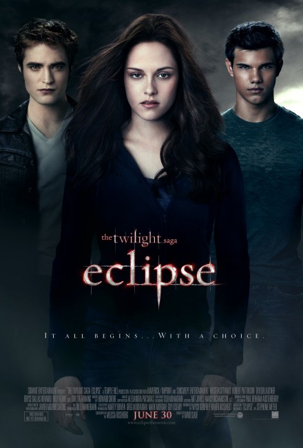
- Eclipse
- Eclipse DVD
- New Moon
- New Moon DVD
- Twilight DVD
- Twilight Trailers
- Twilighter Fandom
- Kallie Ross
-
Ads & Sponsors
-
Books
Ads & Sponsors
Browse Archives
December 2014 November 2014 June 2014 February 2014 January 2014 November 2013 October 2013 August 2013 July 2013 June 2013 May 2013 April 2013 March 2013 February 2013 January 2013 December 2012 November 2012 October 2012 September 2012 August 2012 July 2012 June 2012 May 2012 April 2012 March 2012 February 2012 January 2012 December 2011 November 2011 October 2011 September 2011 August 2011 July 2011 June 2011 May 2011 April 2011 March 2011 February 2011 January 2011 December 2010 November 2010 October 2010 September 2010 August 2010 July 2010 June 2010 May 2010 April 2010 March 2010 February 2010 January 2010 December 2009 November 2009 October 2009 September 2009 August 2009 July 2009 June 2009 May 2009 April 2009 March 2009 February 2009 January 2009 December 2008 November 2008 October 2008 September 2008 August 2008 July 2008 June 2008 May 2008 April 2008 March 2008 February 2008Search Archives
© 2026 Twilight Series Theories | Powered by WordPress | BranfordMagazine theme by Michael Oeser at DER PRiNZ Log in | 67 queries. 1.025 seconds.


